Shougang Ice Hockey Arena
Type
Wayfinding, Environmental Graphics
Role
Lead Graphic Designer, Gensler
The Challenge
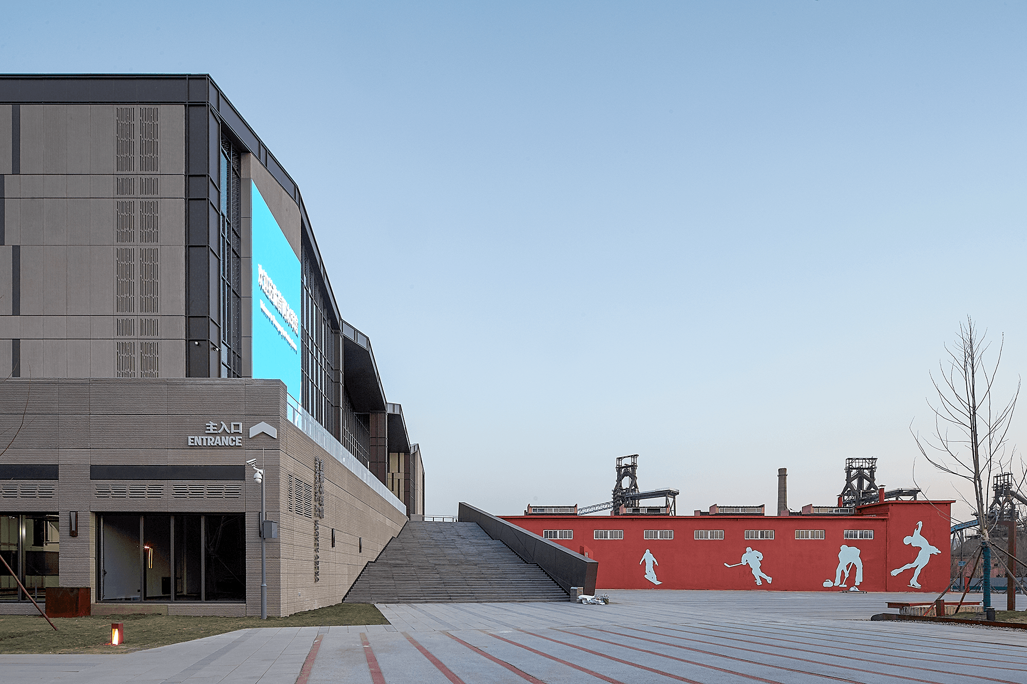
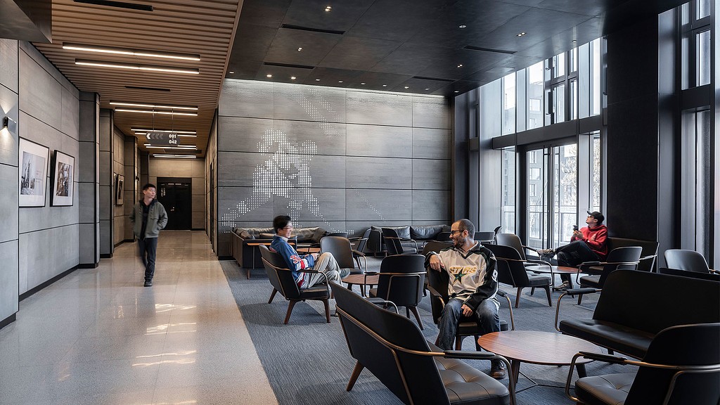
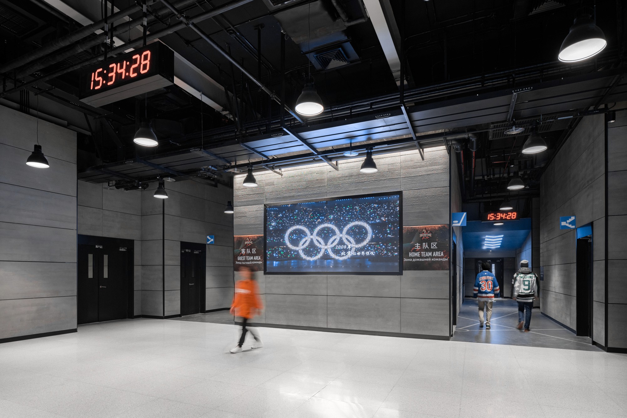
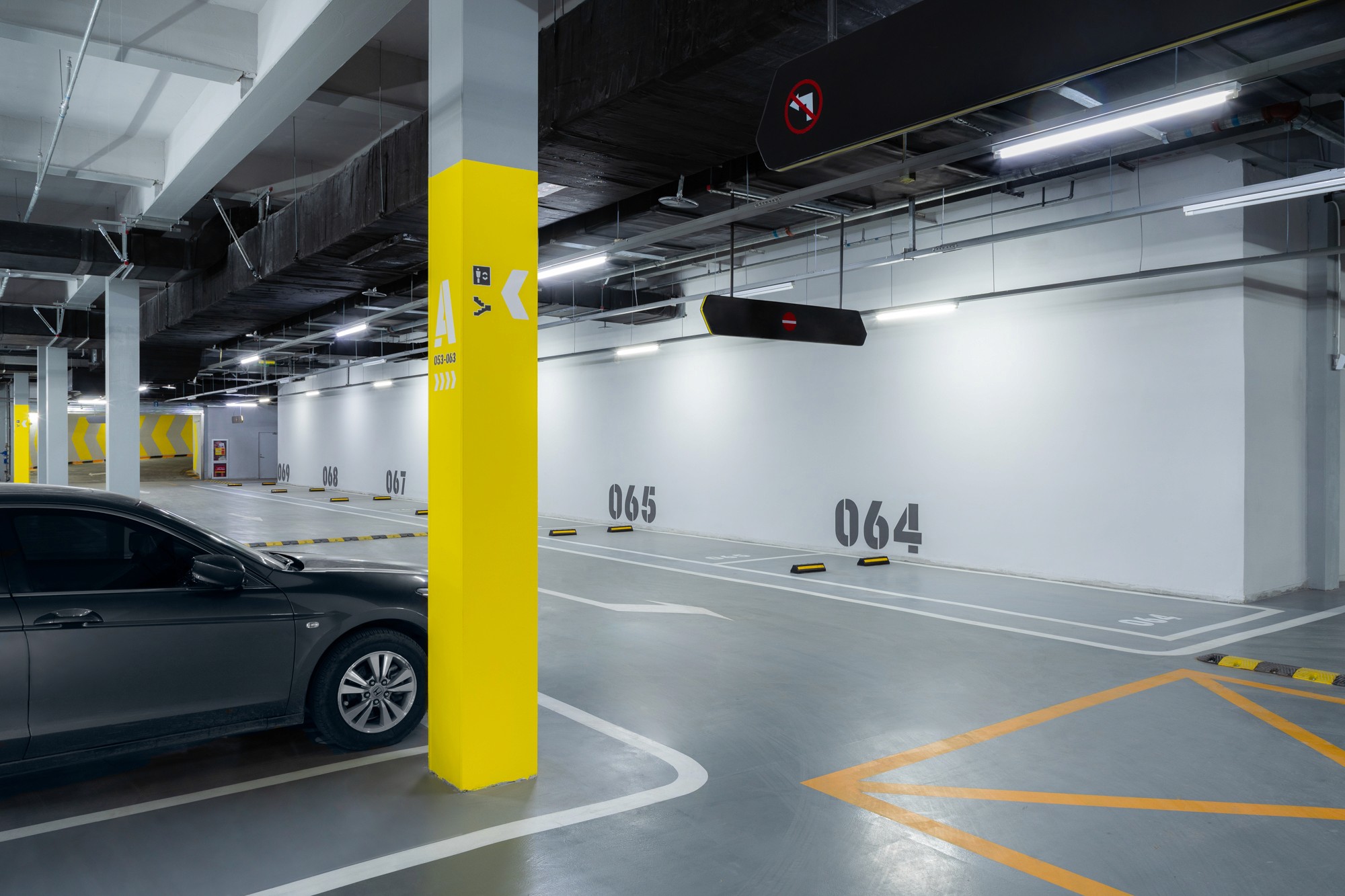
Ahead of the 2022 Beijing Olympics, a national ice hockey training facility was built inside a former steel plant in the Shougang industrial complex. The raw concrete and steel of the building carried a century of material history — the brief needed to work with that, not cover it up. Two programs ran in parallel: an environmental graphics system to motivate elite athletes and give each zone its own identity, and a wayfinding system to direct four distinct user groups — home team, visiting team, press, and VIP — through a complex that would operate at Olympic scale.
The Solution
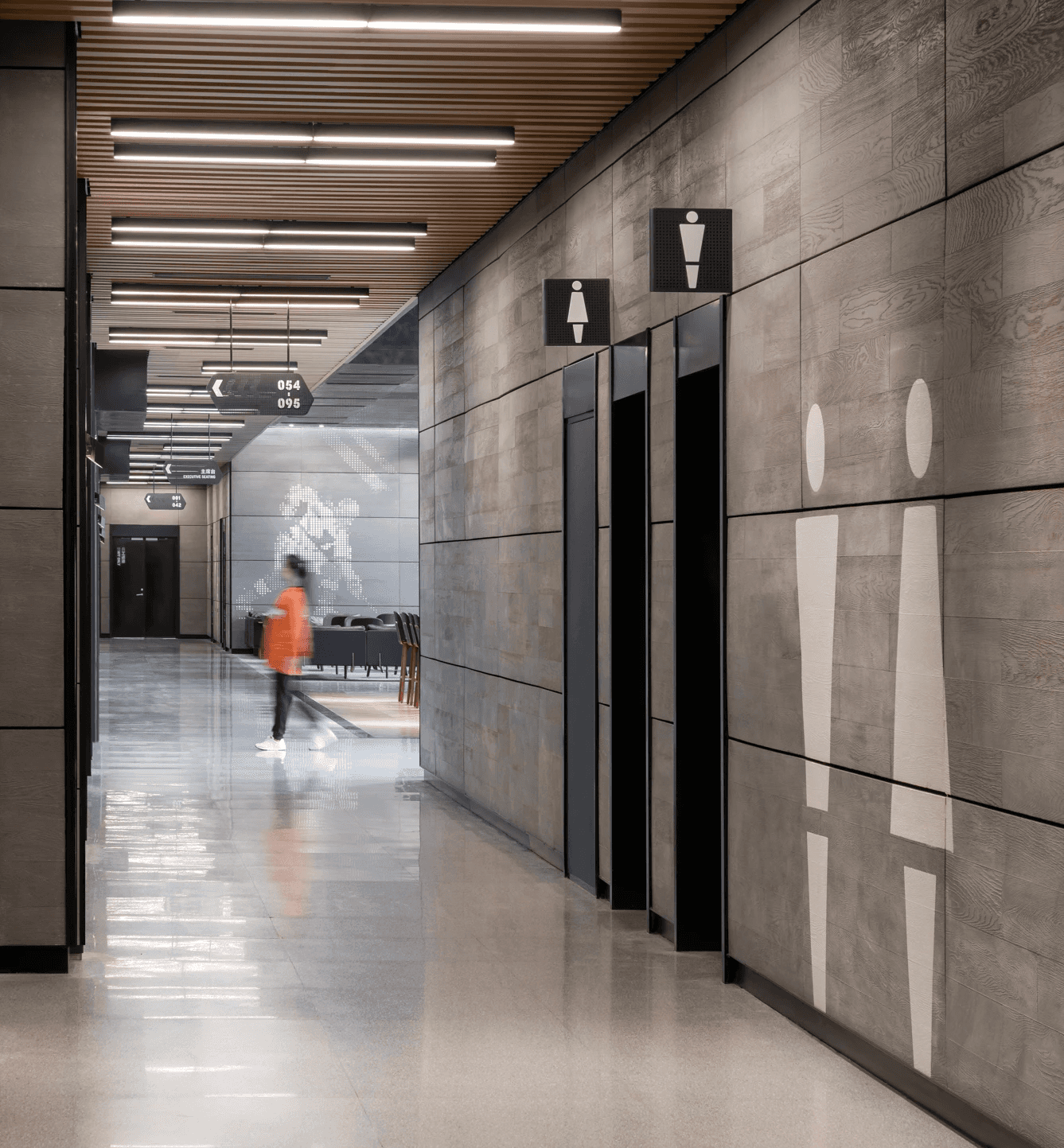
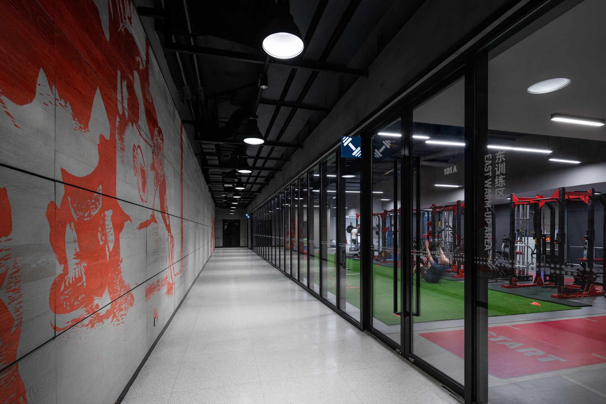
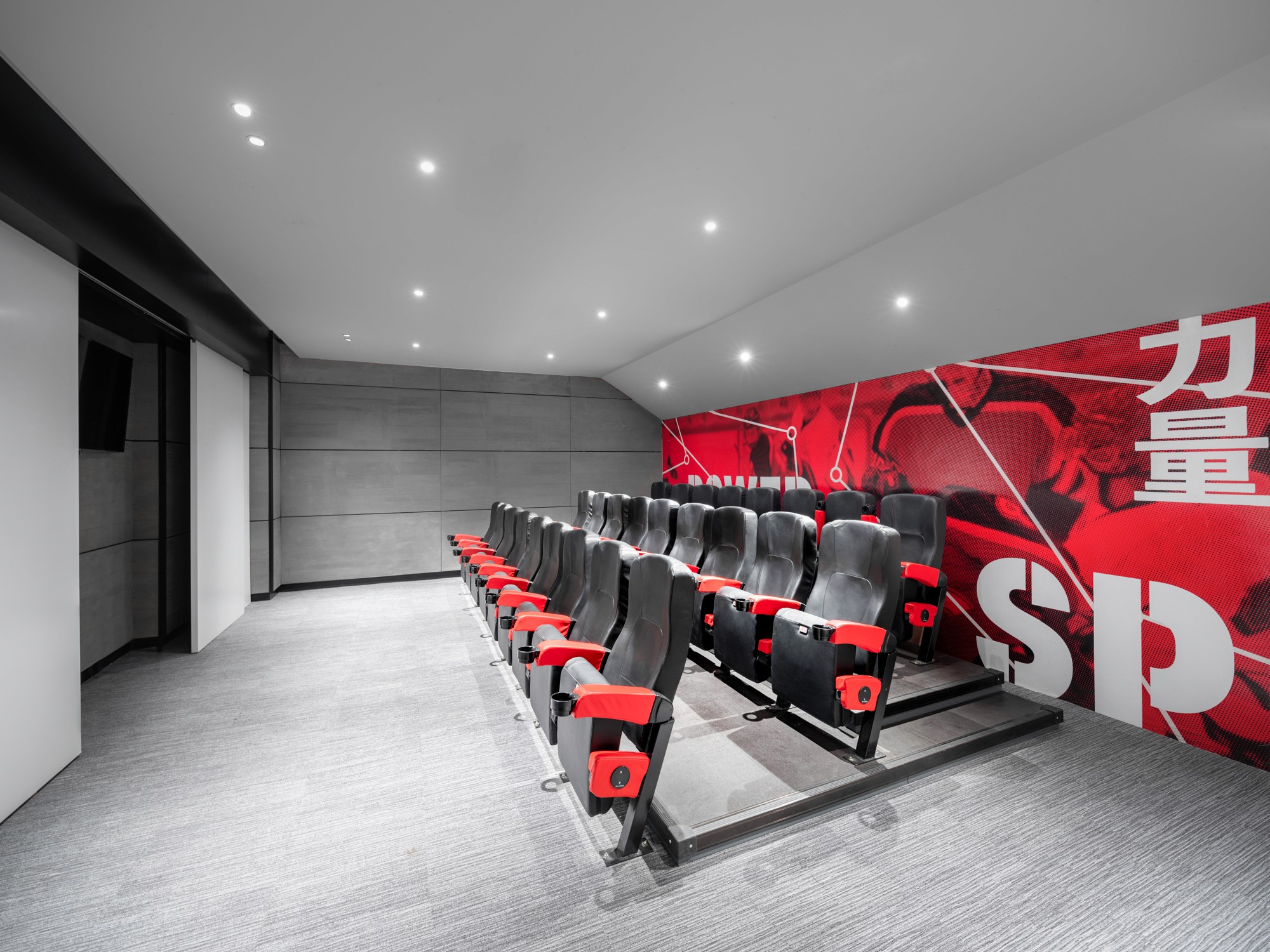
Graphics were applied directly onto raw concrete surfaces, making the industrial substrate part of the design rather than a problem to solve. A bold red palette set the register for the whole complex. Each zone had its own graphic identity. Player lounges carried large-scale motivational typography: Power. Strength. Speed. The changing room corridor became a bilingual face-off: "开球!/ FACE-OFF". Material choices shifted by space — 3M vinyl, screen print, perforated metal plate, neon for the café — each one a deliberate storytelling decision. The wayfinding system colour-coded each user journey from entry to destination: red for the home team, blue for the visiting team, black for press and VIP, yellow for the underground garage. Signage used the same bold typography as the environmental graphics, so both systems shared a visual language and the complex read as one program.